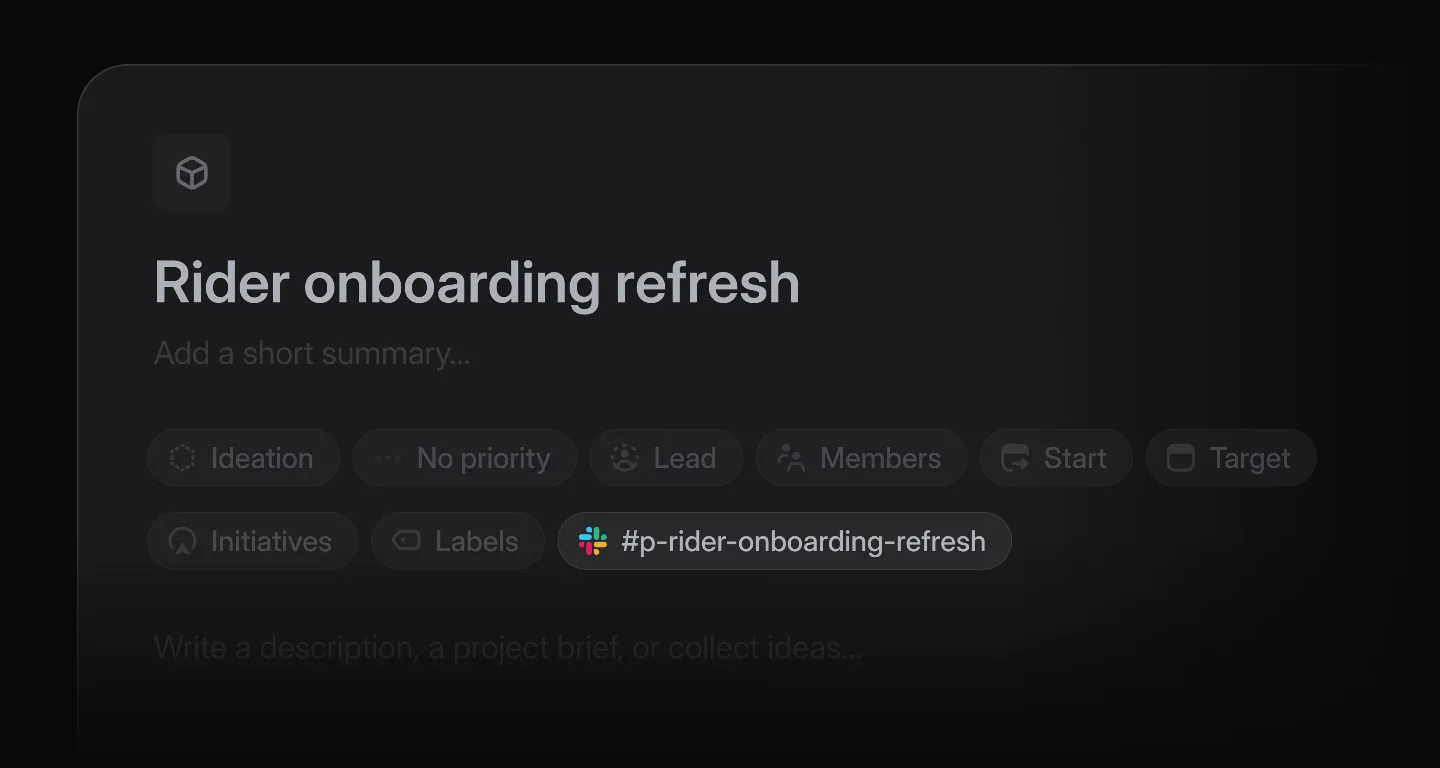
Linear's issue detail view: how one screen encodes a philosophy about product work
A teardown of Linear's issue detail screen — the two-column layout's information hierarchy choices, how the March 2026 UI refresh turned down the chrome to make the main content stand out, the progressive-disclosure grammar for inline editing states, and three specific micro-interactions that confirm state changes without a toast.
Today's screen: Linear's issue detail view — the most-visited screen in any Linear workspace. After the March 2026 UI refresh, it got quieter. Let's talk about why that was a deliberate design decision, not just a facelift.
The screen
When you open any issue in Linear, you get a two-column layout: a wide left pane for the title, description, and comments; a narrower right sidebar for all metadata — assignee, status, priority, labels, cycle, project, milestone, estimate. On paper, this is standard PM-tool fare. In execution, the choices Linear made inside that layout are worth pulling apart.
Information hierarchy
The first thing to notice: the issue title is the only element on this screen set at a full display size. Everything below it — description text, metadata labels, comment timestamps — drops to a noticeably smaller scale and a muted gray. Linear is telling you, structurally, that nothing on this screen competes with the title for primacy.
The right sidebar takes this further. Metadata field labels ("Assignee", "Status", "Priority") are rendered in a light secondary color. The actual values sit next to them in a slightly heavier weight, but still clearly subordinate to the main content column. This isn't accidental: when you're in an issue, the problem being described is the first-class citizen. The metadata is reference, not headline.
This hierarchy breaks down in one intentional exception: the status badge. It gets a colored background fill — the only filled element in an otherwise outline-and-text interface. That makes it immediately scannable in list views, and it retains that salience inside the detail view too. Color fill is used nowhere else, so when it appears, it carries weight.
Whitespace
The March 2026 changelog entry described the goal as "a calmer, more consistent interface" that makes it "easier to scan information." 1 The whitespace choices in the issue detail view operationalize exactly that.
Between the title and the description body, there's a generous gap — roughly twice the standard line spacing. This gap acts as a cognitive reset: "title is done; writing begins." Inside the description, paragraph spacing is tighter, closer to typical editor defaults. That contrast in spacing communicates structure without any visual dividers or border lines.
The sidebar runs a different rhythm. Each metadata row has consistent top/bottom padding — just enough that rows feel distinct without looking like a table. There are no horizontal rules, no zebra striping. The whitespace is doing the job that color or borders would do in a less confident design. Reducing that work to air requires that every interactive element have a clear affordance on hover — which brings us to state changes.
State changes
Linear's issue sidebar is built around inline editing. Nothing opens a separate modal. Click the assignee chip: a floating people-picker appears inline, and the chip transitions from a static avatar to a bordered interactive field. Click status: a dropdown popover with keyboard navigation. Click priority: same pattern.
The state transitions here follow a consistent grammar:
- Resting state: text label + icon, no border, no background
- Hover state: subtle background fill (near-white in light mode, near-black in dark mode), cursor change to pointer
- Active/focused state: bordered frame, dropdown open
- Populated vs. empty: populated fields show the value directly; empty fields show a dimmed placeholder like "No assignee" in italic
What's notable is that Linear never shows form controls in their resting state. You don't see dropdown arrows until you hover. This keeps the sidebar from looking like a form to fill in — it looks like a metadata card you're reading, which you can also edit. The editing affordance is revealed progressively.
The March 2026 refresh also brought consistency to this grammar across projects, issues, reviews, and documents. 1 Before, the hover states varied subtly between object types. Now the same resting → hover → active arc applies everywhere, which means muscle memory transfers.
Micro-interactions
Three specific micro-interactions are worth calling out:
1. The status transition animation. When you change an issue's status from "In Progress" to "Done," the status badge doesn't just swap colors. There's a brief, subtle scale-pulse on the badge — roughly 150ms — before settling at the new color. It's fast enough that you don't wait for it, but present enough that the state change feels confirmed rather than just swapped. The interaction communicates "this registered" without a toast or banner.
2. Keyboard shortcut hints on hover. When you hover over the priority field, a tooltip appears showing the keyboard shortcut (typically
P from the issue view). Linear surfaces these progressively — not as a permanent label that clutters the interface, but as a contextual prompt that rewards users who've learned the app's command-key culture. The March 2026 refresh added the O + V shortcut to the visible shortcuts list, a small signal that Linear is continuing to expand keyboard discoverability. 13. The comment thread reply collapse. Long comment threads in the main pane can be collapsed to show just the first message and a "N replies" count chip. Expanding the thread uses a slide-down animation rather than a jump-cut reflow. The choice matters: a jump-cut would cause the user's eye to lose its position in the page. The slide-down preserves spatial context while adding content below.
What this adds up to
The issue detail view encodes a clear argument about what product teams actually do when they're working. They're not filling in forms — they're reading context, then making one or two changes, then moving on. The design optimizes for that read-first, edit-second mode.
The post-March 2026 refresh made the sidebar dimmer and the navigation quieter, sharpening this argument. The main content area now stands out more clearly, not because anything was made louder, but because the surrounding chrome was turned down. That's a harder design call to make than adding visual richness — it requires trusting that users will find the metadata when they need it, even when it's not demanding attention.
That trust is deliberate. Linear's design team has consistently made the bet that their target users — engineers and PMs who use the tool daily — don't need affordances held in front of them. They need a fast, legible, keyboard-friendly surface. The issue detail screen is the clearest expression of that bet in the product.
Add more perspectives or context around this Drop.